Add HTML & CSS to your Blog
Learning Competencies
By the end of the challenge, you should be able to:
- Set up a basic HTML page with the appropriate tags (HTML, head, title, etc.)
- Add paragraphs, headings, links, images, lists, and/or tables
- Divide content on a page using divs and spans
- Include a viewport meta tag in your HTML files
- Make your blog responsive so it can be easily used on different screen sizes
- Link an external stylesheet to an HTML document
- Position elements using CSS
- Modify element style (size, color, etc) using CSS
- Use classes and ids to manipulate elements
Summary
You learned a bunch of stuff in FreeCodeCamp. Apply that knowledge to transform your index page into something 'you'. The index page is the 'homepage' of your blog. You will need to factor in where and how to list your blog entries on your site.
Time Box
| Activity | Time |
|---|---|
| Planning | 45 minutes |
| Application | 6 hours |
| Reflection | 10 minutes |
Planning
Ask yourself:
- What is my site's primary purpose?
- Who is my audience? (is it kids, adults, academics)?
- How will I build my site to support their user experience?
- Wireframe - can I draw my site layout on paper? Draw it!
- What will my site layout look like on a mobile phone? On a tablet? On a desktop?
- What other directories do I need (e.g. images)? Where do I put that directory?
- Do I also want the style to be applied to all of my blog entries?
Application
Go forth and beautify your index.html page. You want to do enough playing to better comprehend the learning competencies and ultimately feel good about your finished product - be careful not to get lost down the rabbit hole! Use your Toggl/pomodoro timer to keep on track.
Include a link to your blog file te-houtaewa-template.html that you created in 'HTML & CSS Blog set up'. In most Sprints you'll be completing a technical blog post and a human skills blog post. You will then add a link for these blog posts when prompted to in this Handbook.
Your blog needs to cover all of these competencies:
HTML:
- HTML pages with the appropriate tags (HTML, head, title, etc.)
- Add paragraphs, headings, links, images, lists, and/or tables
- Divide content on a page using divs and spans
- Include a viewport meta tag in your HTML files
- Link all HTML files to an external stylesheet (i.e. your
main.css).
CSS:
- Make it responsive so it can be easily used on different screen sizes (You could use flexbox, grid, or media queries for this. For a tip on media queries, check out the next section)
- Position elements
- Modify element style (size, color, etc)
- Use classes and ids to manipulate elements.
This Sprint allows you to get creative, but use the learning competencies as a checklist to focus your learning around and ensure that you have put each of these new ideas into practice. Check with your Facilitator if you are unsure about any of these.
Some tips on responsiveness
Our goal in this exercise is to demonstrate some form of code dedicated to making your website responsive to different screen sizes. As mentioned above, flexbox and grid are two good options, or you can use media queries. If you decide to go the media queries route, here is a good place to get started:
/* widescreen displays */@media only screen and (min-width: 920px) {.container { /* some layout rules */ }}/* tablets */@media only screen and (max-width: 919px) {.container { /* some layout rules */ }}/* phones */@media only screen and (max-width: 400px) {.container { /* some layout rules */ }}
By putting this code block at the bottom of your main.css file, you can add any additional rules in here that you need to fix the parts of your website that break on different screen sizes. You can add as many different classes or IDs into these sections as you like. Responsiveness in CSS can be really frustrating! To test and see if it's working, open up your browser dev tools and click the little mobile view button:
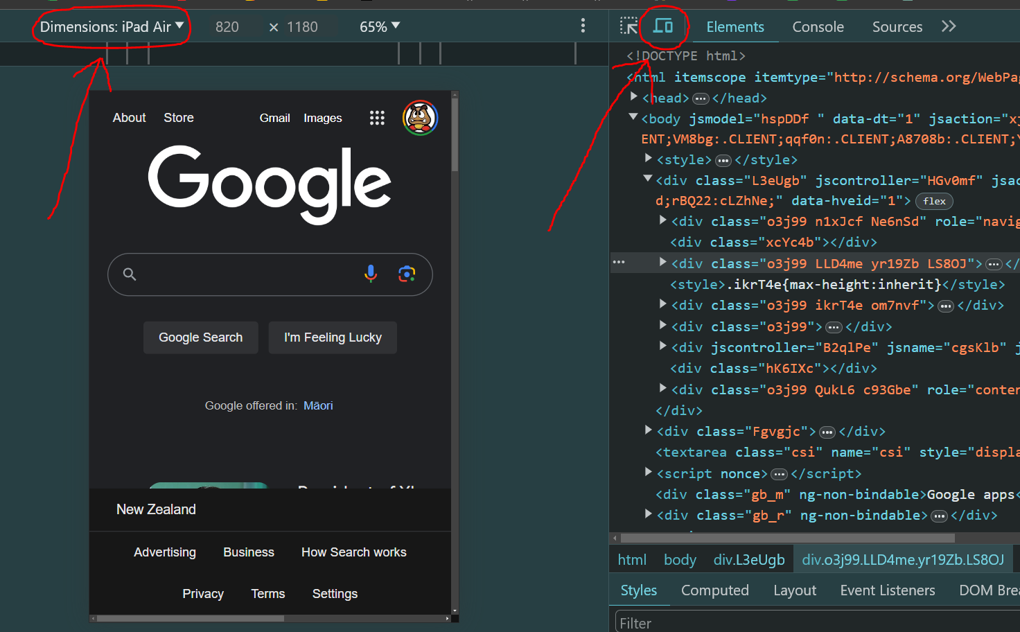
By changing the target screen scale in the "Dimensions" section, you can see how it will look on tablets and phones. There are loads of different options in there, but you should be safe just checking it out on an iPad screen and an iPhone screen.
Helpful hints
If you don't know where to start, draw a wireframe (a black and white draft sketch). Grab a pen and paper and sketch what your index.html page could look like. If this is your first time creating with HTML and CSS, aim for something simple so you can cover the required competencies and keep within the timebox.
There's lots of helpful resources out there, but when you're starting it can be hard to know what you're looking for. A couple of good sites you can refer to:
- W3 Schools is a beginner-friendly resource for CSS (here) and HTML(here). You can easily look up what something does, and they often have a 'sandpit' where you can test how something works in the browser.
- MDN Web Docs is written by developers, for developers. HTML info is here, and CSS info is here.
Use DevTools to change your CSS and see how it looks before adding it to your stylesheet. This is also a good opportunity to learn about different CSS properties.
If you get really stuck for ideas, take a look at our Dev Academy example blog for some inspiration.
Keep in mind
If something isn't working, there's usually an error and you may need to carefully read your file to figure out what's going on.
- Check you've used the correct spelling e.g. CSS uses American spelling, so
colorinstead of colour - Remember most HTML elements need both an opening (
<p>) and closing tag (</p>) - Pay attention to any red squiggly lines in your code editor. Usually it's a helpful message that something isn't quite right and needs fixing.
Reflect
Navigate to your my-reflections-sprint-2 file and add your reflections from this challenge. The questions are under Add HTML and CSS to your Blog Challenge in that file.
Stage, commit and push to GitHub.