Add HTML and CSS to Your Blog
The Big Idea
Take what you learned in HTML & CSS Primer and apply it to your real blog. By the end of this challenge your index.html will be a styled, responsive homepage that is genuinely yours.
⚑ This task is assessed Your blog's HTML structure, CSS, and responsiveness are all assessed. Use the checklist below to make sure you have covered everything.
Your Roadmap
| Section | Time | Required? |
|---|---|---|
| Choose your approach | 5 min | ⚑ Required |
| Plan your layout | 45 min | ⚑ Required |
| Build it | 2-6 hours | ⚑ Required |
| Check your understanding with a chatbot | 15 min | ⚑ Required |
| Reflect | 10 min | ⚑ Required |
Choose your approach
Pick one of these three approaches:
Option A — From scratch
Design and build your own layout from a blank index.html. Good if you want full control.
Option B — With a chatbot Use a chatbot to help you plan and prototype, then edit the code until you fully understand it.
Try: "Help me design a simple, responsive blog layout using HTML and CSS. Explain the structure first, then show a small code example."
Important: do not copy-paste code you cannot explain. Use the chatbot to understand, not to skip.
Option C — From a template
- Open
index.htmlin yourblogrepo - Copy the contents of this HTML template into it. Commit.
- Open
styles/main.css - Copy the contents of this CSS template into it. Commit.
- Run
npx viteand visithttp://localhost:5173 - Read through the code, then customise colours, fonts, and layout to make it your own
- The template is already responsive — it uses flexbox and a media query at 700px. Read through the CSS to see how it works.
Plan your layout
Before writing any code, sketch your layout on paper. Answer these questions:
- What is the primary purpose of your blog homepage?
- Who is the audience?
- What will it look like on a phone? On a tablet? On a desktop?
- What sections do you need — header, nav, main content, footer?
- Where will links to your blog posts go?
Keep it simple. A clean, working layout is better than an ambitious broken one.
If you chose Option C, you can skip or adapt this step — the template already has a layout. Focus on customising it to make it your own.
Build it
Work through your plan. Use your Toggl timer to stay inside the timebox. Time will vary depending on your approach:
- Option A (from scratch) — up to 6 hours
- Option B (with chatbot) — up to 4 hours
- Option C (from template) — up to 2 hours
Your blog must cover all of these:
HTML:
- Correct document structure (
html,head,title,body) - Paragraphs, headings, links, images, lists, or tables
- Content divided using
divandspan - Viewport meta tag in the
<head>— this tells mobile browsers how to scale your page correctly:<meta name="viewport" content="width=device-width, initial-scale=1.0" /> - All HTML files linked to
main.css
CSS:
- Responsive layout — works on phone, tablet, and desktop
- Elements positioned using CSS
- Styles applied (size, colour, font)
- Classes and IDs used to target elements
Responsiveness tip — how to test and implement
Responsive design means your page looks good on phones, tablets, and desktops — not just wide screens.
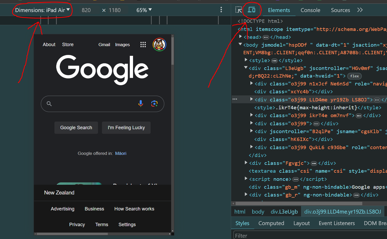
To test it, open your browser's DevTools — Cmd+Option+I on Mac, F12 on Windows/Linux. Click the mobile view icon (two overlapping rectangles) near the top of the DevTools panel. You can then select different device sizes like iPhone or iPad.
Figure 1: The mobile view toggle in browser DevTools
There are three common approaches to making a layout responsive — use whichever makes sense for your design:
- Flexbox — good for arranging elements in a row or column
- Grid — good for two-dimensional layouts
- Media queries — apply different styles at different screen sizes
If using media queries, this is a starting pattern:
/* widescreen */@media only screen and (min-width: 920px) {.container {/* layout rules */}}/* tablets */@media only screen and (max-width: 919px) {.container {/* layout rules */}}/* phones */@media only screen and (max-width: 400px) {.container {/* layout rules */}}
If you get stuck:
- Check spelling — CSS uses American English (
colornotcolour) - Check every HTML tag has an opening and closing tag
- Look for red squiggly lines in VS Code
- Try W3Schools for quick lookups with live examples
- Try MDN Web Docs for detailed reference
- See the Dev Academy example blog for inspiration
Check your understanding with a chatbot
Once you have built something — even a rough version — use a chatbot to consolidate what you learned.
Step 1 — Set the scene:
"I just built a blog page using HTML and CSS for the first time. I want you to check my understanding by asking me questions — don't explain anything yet, just ask."
Step 2 — Answer in your own words. Don't look anything up. It's fine to say "I'm not sure."
Step 3 — Fill the gaps:
"Based on my answers, what's the one HTML or CSS concept I'm most unclear on? Explain just that one thing with a short code example."
Step 4 — Check your mental model:
"I think the CSS box model works like [your analogy]. Is that accurate? What does my analogy miss?"
Why this works: Retrieving from memory — even imperfectly — builds retention far more effectively than re-reading.
How to know you've nailed it
| Level | You can... | ||
|---|---|---|---|
| 🪨 | Intro Climb | Build a page with correct HTML structure and an external CSS file linked | ⚑ Required |
| 🧗 | Core Ascent | Add responsive layout that works on phone and desktop, using classes and IDs | ⚑ Required |
| 🏔️ | Summit | Explain every line of your HTML and CSS and why you wrote it that way | ◎ Optional |
Reflect
Open sprint-1/my-reflections-sprint-1.md and add your answers under the Add HTML and CSS to your Blog heading.
Stage, commit, and push.
The Big Idea (revisited)
HTML gives your blog its structure. CSS gives it its appearance. You have now built both from scratch — or read through and customised someone else's — and that means you understand what you're looking at. Every sprint from here you will add to this blog and your skills will compound.